Adaptive

BRANDING | VISUAL IDENTITY | LOGO DESIGN
Adaptive Security is a cybersecurity startup focused on constantly evolving to detect and defend against emerging threats.
+Problem
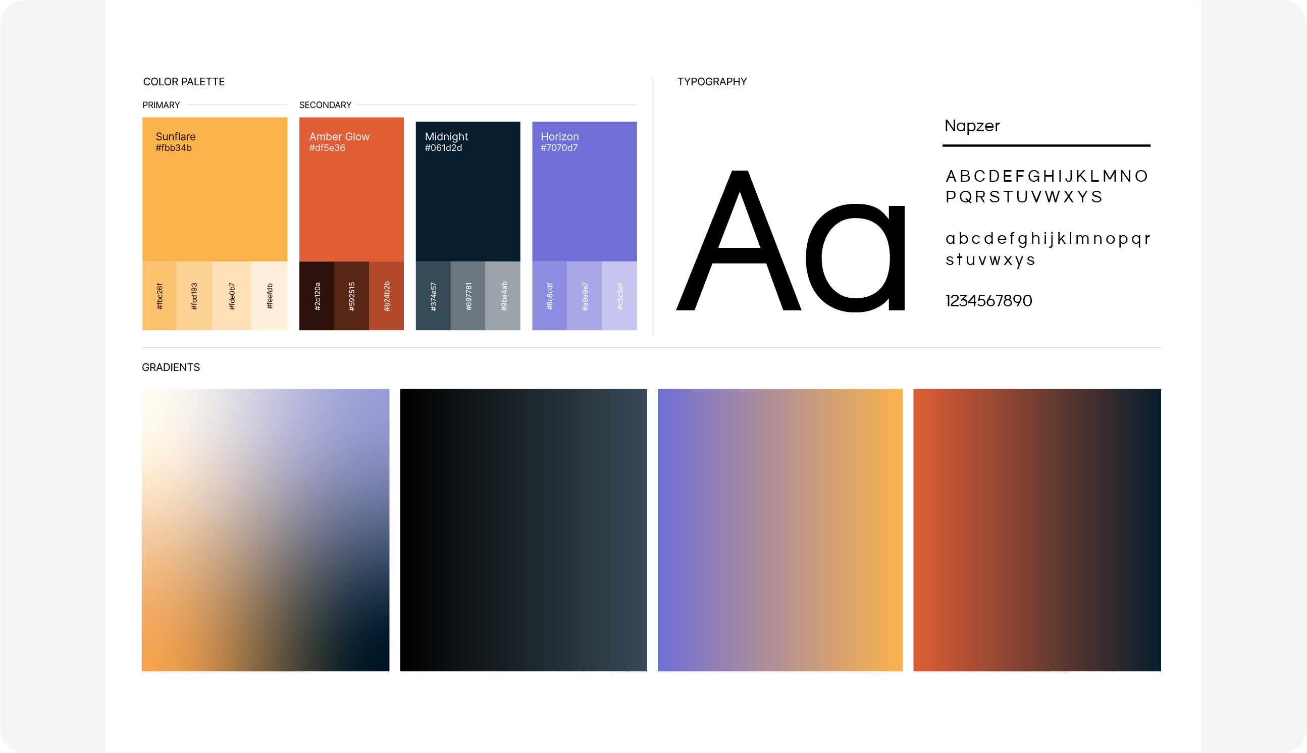
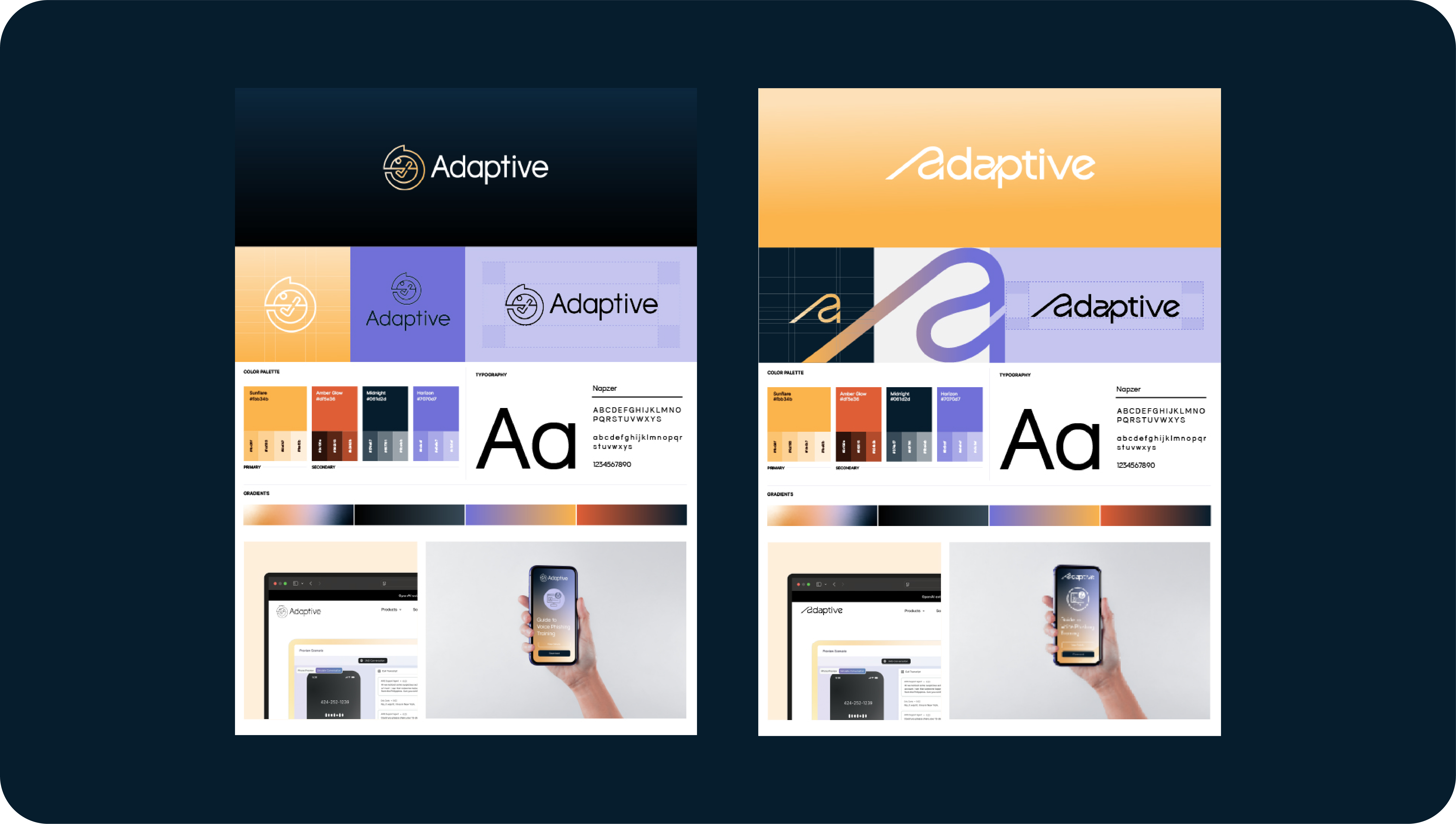
Develop two logo and icon concepts for Adaptive Security, creating a friendly, approachable identity with the warmth and personality of a consumer brand—distinct from typical SaaS aesthetics. The brief called for one abstract icon and one resembling an “A” shape, accompanied by a Sunrise color palette and typography exploration
+Solution A
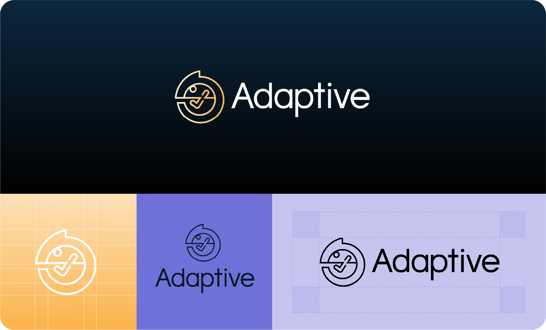
For the first concept, I designed a chameleon icon to embody the brand’s core mission —constantly evolving to counter new threats. Just as a chameleon changes its colors to adapt to its environment, the company adapts to detect and defend against cybercriminals. I explored ways to visually merge adaptability with protection. This led me to integrate a security checkmark into the design, shaping it as the chameleon’s leg—symbolizing both agility and trust.
+Solution B
For the second version, I pursued a minimalist approach that emphasizes fluidity, adaptability, and transformation. The design evokes movement while simultaneously suggesting both a capital “A” and a lowercase “a,” reflecting the concept of continuous shape-shifting. I also refined the wordmark, integrating it with the signature “A” to create a cohesive and distinctive look.


